

买过此书的顾客还买过
点击排行
您浏览过的商品
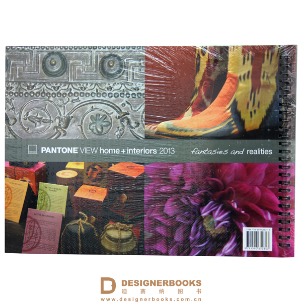
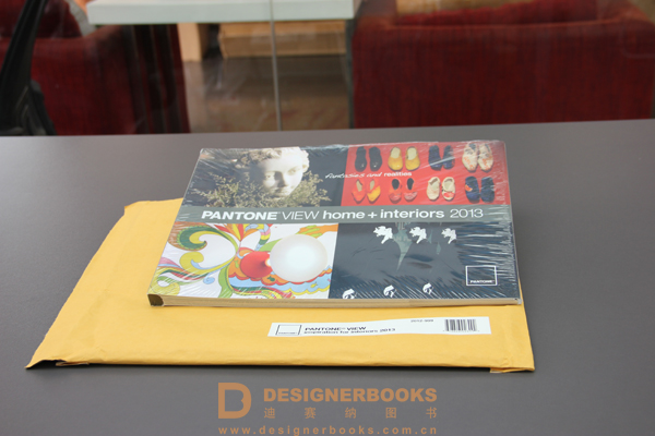
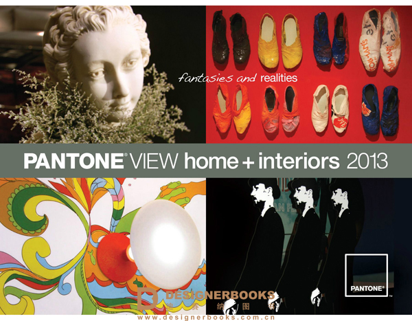
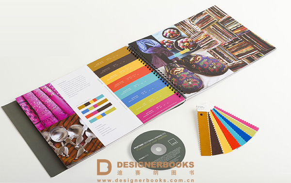
PANTON EVIEW 室内家居色卡 2013色卡色彩报告 附加DVD 2012-998
-
译 名:PANTONEVIEW home + interiors 2013作 者:PANTONE出 版 社:美国书 号:9781590652343出版时间:2013-02-27装 帧:精装规 格:mm * mm
- 市场价:1000.00 元 会员价:900.00 元
- 购买数量: 件 库存:有

- 详细介绍相关图书书评
内容简介:
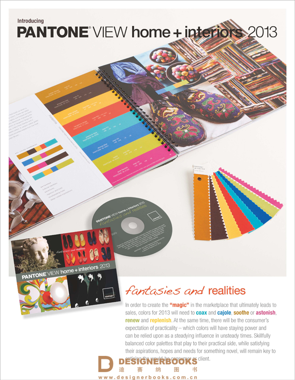
In order to create the“magic”in the market place that ultimately leads to sales, colors for 2013 will need tocoaxandcajole,sootheorastonish,renewandreplenish. At the same time, there will be the consumer’s expectation of practicality – which colors will have staying power and can be relied upon as a steadying influence in unsteady times. Skillfully balanced color palettes that play to their practical side, while satisfying their aspirations, hopes and needs for something novel, will remain key to enticing the would-be consumer or client.
PANTONEVIEW home + interiors 2013 includes:
1” x 4” cotton swatch stripsof each of the 75 forecasted colorsDetachableprinted color cardof each trend palettePANTONE COLOR MANAGERsoftware for digital designCMYK valuesof each of the forecasted colorsDVDcontaining still images of photos used to illustrate individual trend palettesSummary Page highlighting additionalkey color insights and direction


- 没有相关内容!

- 没有相关内容!